• Making An Interesting Title Screen

    For several months, Survivors of Late Earth has had a very bare bones title screen, featuring a solid color background, a very basic logo, and a few navigation buttons. Nothing else. For several months, that was fine as I was much more focused on getting vital in-game systems added to the game.

    Oftentimes, however, an aspect of the game will just abruptly jump out at me, demanding attention, and that’s what happened with the title screen.

    Very basic, boring title screen.
    A very basic, boring title screen.

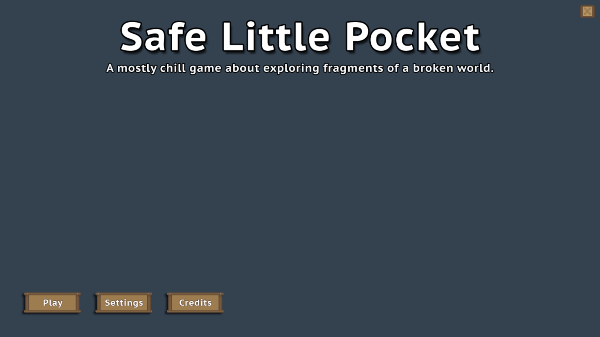
    As you can see, nothing special going on there in the original version of the title screen. I put the bare minimum amount of work into it, knowing in the back of my head that eventually, I would go back and work on it, making it something more interesting.

    In past iterations of the game, I used commissioned art to make a static background like this:

    An old iteration's title screen.

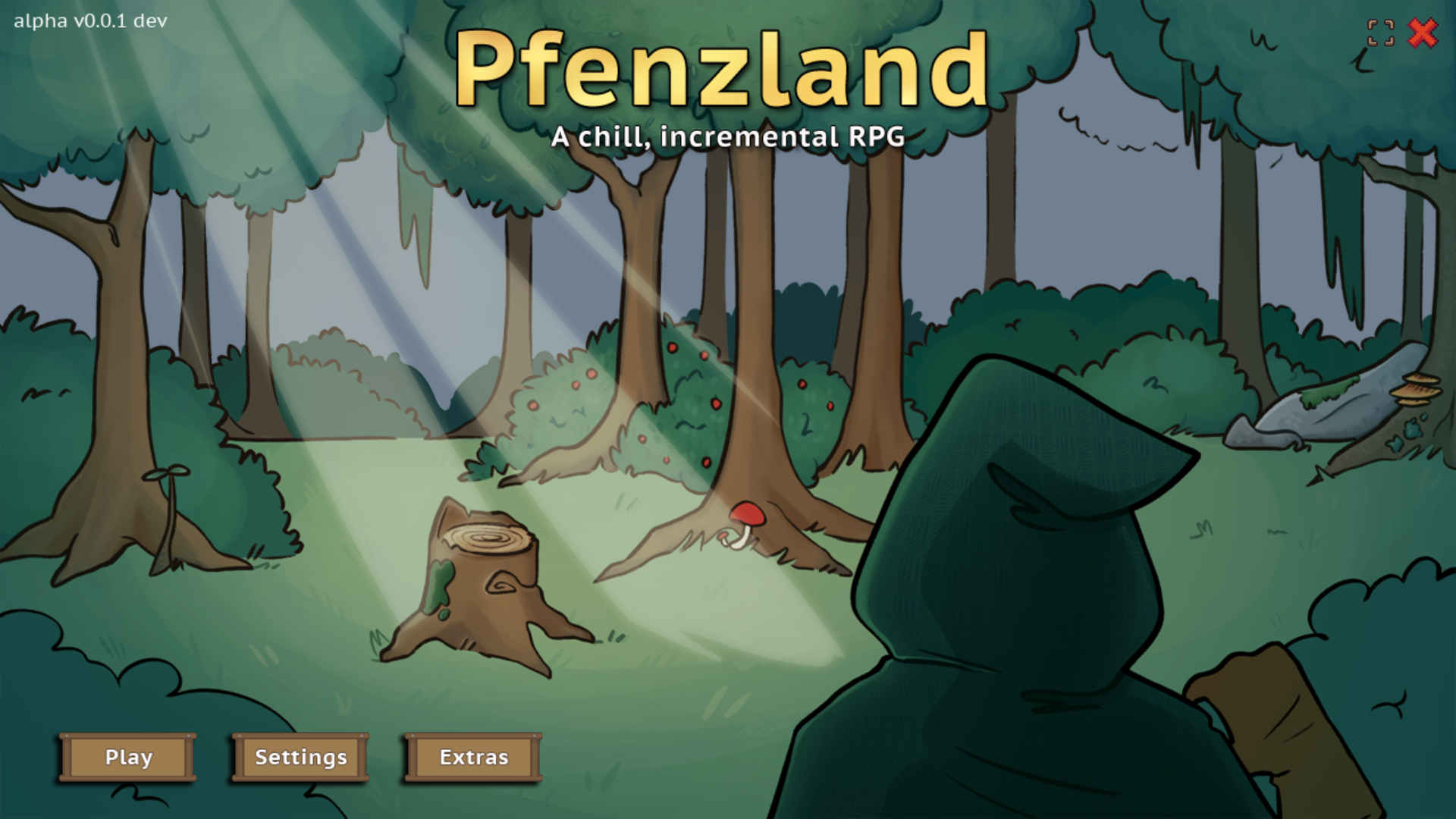
    I had thought about doing something like that for this iteration, but a stubborn idea wedged its way into my head. If Late Earth is no longer a solid, cohesive planet but rather a belt of fragments and debris or something of the like (kind of like an asteroid belt), wouldn’t it be cool to see some of those fragments floating on through the void?

    A little something I learned: unlike what Hollywood and popular culture has taught us, meteors and asteroids don’t tend to just placidly float along. That’s not how they work at all!

    Sometimes, reality needs to take a seat, though. Most people don’t realize that cosmic objects don’t operate that way, so they’re not going to care whether my fragments are floating or not. For my part, I wanted to see floating fragments. So, that became one more random option to add in.

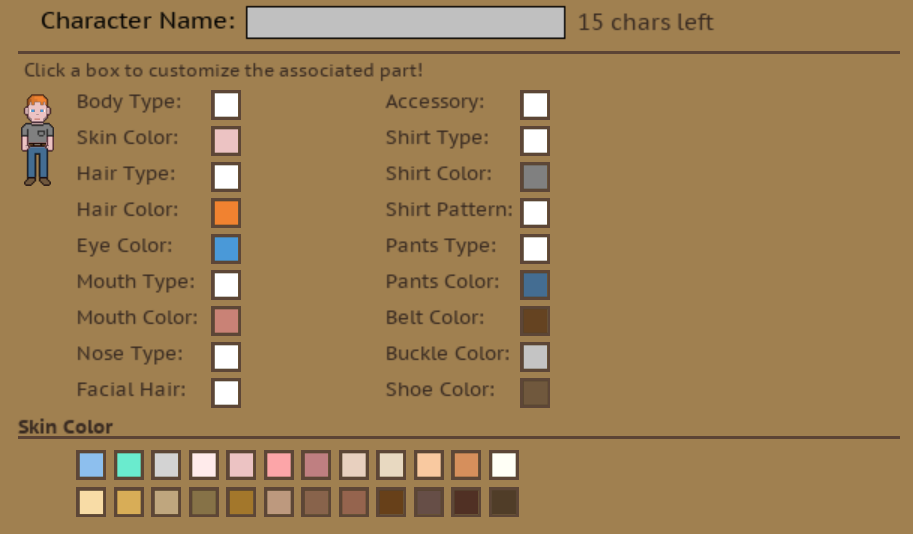
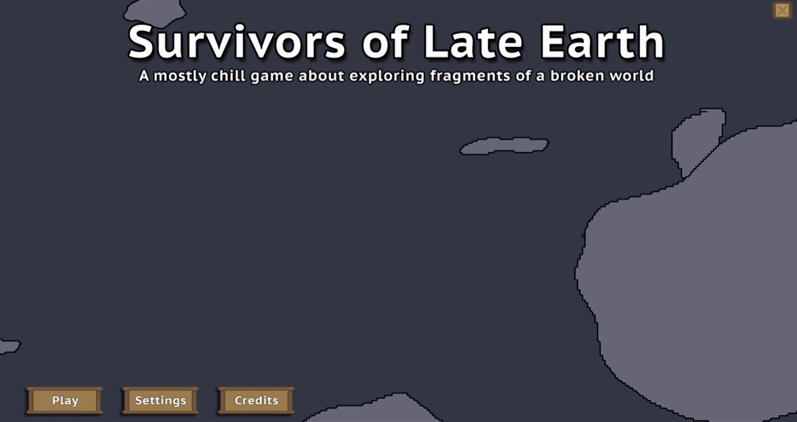
    I changed the color of the background to the ‘void’ color I’ve already established in the game. I also drew 32 crappy world fragments. You’ll see further on down the post that they are indeed epitome of ‘placeholder’ art. At any rate, they would do for now. At this point, it was a proof of concept to see if it would operate and look the way I was envisioning.

    So, I determined a number of random options for any fragment instance that would come gliding across the screen:

    • Which fragment (of 32 possible fragments) would it be?
    • At what coordinates would a fragment start its journey across the screen? (Don’t want them all starting in the same spot!)
    • How fast would a fragment go?
    • Would it float along placidly or streak by speedily?
    • Would a fragment rotate?

    Fragment rotation didn’t work quite like what I imagined and it was so comical looking that it totally broke immersion. That had to go. (It did give me a good laugh, though.)

    With a lot of testing, I settled on 9 instances of fragments. This made for a more natural and often sprawling spread of fragments.

    Simulating an asteroid belt.
    Close to what I was envisioning, this little experiment was fun!

    Now whether I keep this as the title screen remains to be seen. I hope that I do, but I never want to lock onto an idea so firmly that I don’t consider better options if they present themselves.

    The fragments, as pointed out by a friend, really do lend themselves to the mythology of the game as they point towards what remains of the Earth. Lots and lots of fragments. Thankfully, for the player’s sake, there’s plenty enough massive fragments remaining to where they can travel to those fragments and do a variety of interesting things.

    So, with that said, I do think that there’s a good chance that this iteration of the title screen will stay. Right now, it just makes sense. If you’ve got an opinion, feel free to share!

    Posted by Char the Traveler on:

  • A Hundred Different Little Things

    My setup for keeping track of what I’m working on, what I plan to add, things to tweak, bugs I need to fix, and other important things is kind of rudimentary. It’s a list in a Notepad file categorized by Things to Add, Content to Finish Adding, Adjustments to Make, Bugs to Fix, and Feedback Received.

    On any given day, the file is usually open, and it’s one of the first things I look at on my computer in the morning. Depending on how busy a day is going to be will determine what I work on. Lots of time? I’ll pick something more demanding. Not a lot of time? I’ll pick something quick and easy. I’ve thought about using AnyType to make a more accessible, visually aesthetic running list of things to work on, but for right now, the Notepad file is good enough for my purposes.

    I’ll admit that it’s fun adding posts to this blog about what’s been added along with pictures and explanations. Sometimes, though, what’s been added or changed doesn’t really warrant a blog post. These changes are often small and unimpressive.

    It is quite easy to make hundreds of changes without any of those things being particularly newsworthy. So, even if I’m not posting anything fun and interesting, a lot is still getting done. πŸ™‚

    Always Looking to Improve

    A good example of a change that was unimpressive but vital was the recent effort I made to refactor the save data. Half of it was being saved to the original DS map data structure I made. The other half was neatly sorted into individual maps which were then embedded into the original map. As such, half of the save data code was different from the other half.

    I considered this ‘low key annoying.’ The different save code structures didn’t make things any harder to do, but when I needed to add new data, I had to stop and determine real quick which type of save code I needed to use. Ugh. Annoying. It’s kind of disruptive to have to differentiate.

    So, needless to say, I’d been planning on updating the old code so that the structure of all save data matched.

    Refactored code
    A bunch of save data, refactored and finally organized.

    I didn’t figure it would take too awful long to get everything converted, but it ended up taking all day long. Talk about tedious! It was worth the effort, though, as adding save data just seems to go so much more quickly now.

    After refactoring the code, I decided to sort the subsets of data so that it was consistent among the different objects and scripts that it’s referenced by. I was a little bit surprised at how unorganized all of that data actually was. I try to keep my code as clean and readable as possible, but when I’m tired, I may get a little lazy and sloppy with things like placement.

    So, that is all now organized. What a relief. It’s also a lesson re-learned. It’s really worth it to take the time and keep your code well-organized as you go so that you don’t have to fuss with it later.

    The Character Creator Integrated Into The World

    One final thing I wanted to touch on in this post: I thought a follow-up on the Character Creator system was in order.

    As you can see below, the Character Creator has been integrated into the game world. It costs nothing to change your character’s looks and is accessible from the Character module. It is considered a world location, so clicking to access it initiates a teleport.

    The Dressing Room
    The Character Creator integrated into the game world itself, officially known as the Dressing Room location.

    I’m pretty happy with how it turned out and while it’s functionally complete, I do have to go in and add a lot more options for the various parts. Right now, though, I’m focused on adding and finishing major systems. I plan on fleshing out content like this at a later date.

    Posted by Char the Traveler on:

  • Female Character Art Fixed and Character Avatar Added

    While play-testing the Character Creator system, I realized that there was an issue with the female character’s art. I was already aware that the female head was wider than the male’s head. The more I looked at it, the more glaringly obvious it became to me that it needed to be fixed.

    Female Character Art Improvements

    Before and after fixing the female character art

    I moved the female character’s head over by a pixel and adjusted all facial elements accordingly. It’s a subtle change, but it looks better, I think. While I was at it, I updated the inner portion of the breast art to be a lighter shade so it’s not quite so pronounced. I’m not sure I’m satisfied with the lightness of the shade, but for now, it’ll do.

    Finally, An Avatar

    With everything added and functional in the Character Creator, it was time to implement the character in its first form in the game: the character avatar.

    Poor Tedd. Holding down the fort for 6 months.
    Poor Tedd. Holding down the fort for 4 months in one form or another.
    It's Eloise's time to shine.
    It’s Eloise’s time to shine.

    For 4 months of development, a random ‘character’ named Tedd served as the placeholder for the character avatar. Why Tedd? It just popped into my head as an easy character name, and that’s the character that’s been made and re-made for testing likely thousands of times.

    With character avaters added into the game, Tedd finally gets to take a well-deserved and permanent break from being the avatar placeholder!

    Character Creator Not Quite Finished

    I was pretty happy, thinking that the Character Creator was pretty much done. All that was left to do, I thought, was to add the character avatar, and embed the code inside the game in order to provide the ingame functionality for a player to edit their character.

    Boy, was I wrong. I realized I’d only added one accessory slot. This was supposed to cover hats, glasses, earrings, and accessories in other facial locations. It occurred to me that 1 slot was just not going to cut it. So, I’ve decided that I’m going to add 3 additional accessory slots.

    There will be 1 accessory slot for the head (for hats and stuff that sits atop the player’s head), 1 slot for eyewear (including glasses, eye patches, goggles, stuff like that), 1 slot for earrings and ear wear, and finally, 1 slot for miscellaneous accessories (like a clown nose or necklace.)

    So, this is going to make it take longer to finish the system, but that’s not a big deal. I had planned for it to take about a week to complete the whole system. We’re on day 5 of collective days of development, so we’re well within the projected time frame and working at a pace where the system should be finished by the expected time. πŸ™‚

    Posted by Char the Traveler on:

  • Creating the Character Creator System

    I have this list of systems I still need to add to the game, and it’s sorted between systems that are quick adds (a few hours to complete to up to a few days) and systems that I know are going to take a lot more time to make (like a week or two if not longer.) The Character Creator system fell firmly into the second type. I was anticipating easily a week’s worth of development time to make it.

    I have spent 3 days working tirelessly on it, and the first iteration is now complete. I have an additional option I want to add (belt type), and I need to add more color options for things like the character’s lips, shirt, pants, belt, and belt buckle.

    With that said, I want to show you a behind-the-scenes look at the system being built. Let’s start with what the panel looked like initially:

    Not much there yet.
    Not much there yet!

    As with any system, you have to start somewhere. I wasn’t even sure how the system would look. I just knew that player needed to see the character art change in real time and, of course, they needed to have options visible that they could interact with. Hoping for inspiration, I did a quick Google search to see what other games’ Character Creator systems looked like. One screenshot seemed to kick off something in my mind, and quickly, I had an idea for what my Character Creator could look like.

    Oftentimes, before I add a system, I will sketch out by hand what I want it to look like. If I can visualize/see the system, then I can easily translate that into code. I printed out a screenshot of the bare panel, and sketched out the system.

    Drawing out what I'm envisioning the system looking like.
    Arrrr

    Ignore the sloppy handwriting! I wasn’t going for neatness. I was hastily trying to get what I envisioned down on paper!

    With a visual to reference, coding the system in could begin.

    Adding the labels and option interaction boxes.
    Adding the labels and option interaction boxes.

    I realized the character panel was a tad too bright, so I changed the color to something a tiny bit darker. I updated the character art so that it reflected the current selections. I added all of the colors governing the character’s skin, hair, eye, mouth (lip), shirt, pants, belt, belt buckle, and shoe colors.

    Adding in the color options.
    Adding in the color options. Was a little perplexed that the character art looked degraded.

    It was important to me to provide a wide variety so that players have a generous amount of options and so that they could make characters in countless visual combinations. This is something that bugs me about some games. When the character options are very limited, it stymies my ability to tailor the character to my preferences which, in turn, makes it harder to connect with and build stories in my head about the character.

    In real life, people come in all manners of shape, colors, and sizes.

    For sake of simplicity, I’m planning on sticking to two main body types (male and female), but am going to use the various types of color options to let players really dig in deep and customize their characters.

    Next came adding in different part types including body type, hair, mouth, nose, facial hair, accessory, shirt, shirt pattern, and pants. For each type, I’d add at least one option. For example, for shirt types, I added two different types of shirts (one with a pocket and one without.)

    Adding in the part types.
    Adding in the part types.

    I showed the progress I’d made to my husband, and he thought it was awesome, but he also suggested that I make the art size bigger because he just couldn’t see it well. I had, at one point, made the art bigger, but as the art was experiencing some weird quality degradation issue, it only made it look worse when larger. I figured that at a later point, I would figure it out.

    Fixed the character art degradation issue and doubled the art size by 2.

    And I did. As it turns out, pixel interpolation works great for smoothing out stuff like text, but it makes lower res pixel art look positively awful. Once I narrowed down this as the problem, I was able to selectively turn pixel interpolation on and off for certain parts of the code. I doubled the art size and voila, it’s easy to see and looks so much better.

    With that little roadblock behind me and all options added, it was time to look at adding the art for the female body type. I’m not going to lie; I was a little intimidated about doing this. I am admittedly a novice pixel artist. You can tell that by the basic quality of the art. I’m learning, though, and this, I knew, would be an opportunity to gain experience.

    Added the female character art.
    Added the female character art and adjusted the options.

    So, it’s not perfect and she’s way more busty than I intended her to be, but hey, you gotta start somewhere! I made a number of changes to the male template to arrive at this point. The female is a pixel shorter, is not flat-chested, doesn’t have much of a neck, and has thinner arms, different hands, a smaller torso, a shorter (and slightly wider) head, and has side-eyelashes.

    I removed male features including facial hair and belt buckles as options for the female body type. These changes seemed appropriate. πŸ˜‰

    This morning, I de-bugged the female part of the Character Creator, and as a whole, it’s now functionally complete. I think it turned out good; it’s clean and intuitive. I found that experimenting with different colors was fun. It’s easy to make wildly different-looking characters.

    In closing, I do have some iterating to do. I intend to iterate on the art over time, improving it gradually. I want to add different belt types for both body types (in addition to opting out of belts entirely.) I also have a ton of color options I need to add. The iteration is going to take some type, but the belt type addition and color options should all come easily, and will likely be done by the end of the day!

    Want to see the initial development of the character art? CLICK HERE.

    Posted by Char the Traveler on:

  • Always Be Iterating

    When I get into a video game, I mean really get into a video game, I like to deep dive into as much of it as I can. This includes looking at behind-the-scenes pictures, videos, concept art, and documentation of the game’s development. Seeing where a game is versus where it started out has always been compelling to me.

    I remember seeing some of the early footage of Stardew Valley well before it was polished and the art improved to what it is today. I thought it was pretty amazing.

    In that vein, I do still find myself very much in the ‘early days’ of the art development part of this project. I have considered hiring someone else to produce the pixel art, but I also think that with enough time and effort, I may be able to make the art myself. It’s just going to take a lot of iterating between now and then.

    August, before and after
    August, before and after.

    Looking to iterate on some art today, I focused on a particular piece of art that’s been needing some attention — the character art template that I’m using to make NPCs (and will be using to create the Character Creator and Dressing Room modules.) On the left, you can see the old art for August, the first NPC ingame. He looks hunched and short. After today’s iteration, his legs and arms are longer, and his feet are no longer stubs. Oh, and he has a neck now! I am sure to continue iterating on the template (meaning I don’t consider it finished), but this is definitely a step in the right direction!

    For anyone that’s wondering: no, the female version is not made yet, and yes, it is planned to be added. πŸ™‚

    The Original Character Art

    The original character art.
    This little guy was
    my iteration on an art asset.

    A quick share for people like me that like seeing this sort of stuff. Some, but not all, of the pixel art I create starts out its life as art assets someone else created. In this case, I used Snoblin‘s Top-Down Prototype Character. (This is a free asset, and Snoblin has some other great assets available.) If you’re curious, you can go look at the asset page to see what the original, original art looked like.

    Anyways, back to what I was saying: I think the original art asset is great in its original form, but I quickly realized I was going for a different look. So I’ve iterated on it a few times to great effect. It doesn’t even look like the original art asset anymore.

    Iterating on the base character art.
    Progress!

    Posted by Char the Traveler on:

  • No Zero-Dev Days!

    Today ended up being a lot busier than expected. Not really a surprise to me; I tend to stay busy even if I don’t have anything planned for a day.

    If you read my About page, then you might remember this little bit:

    I’m a fan of the game, Erenshor, and something that its dev said really made me think. He said that he works on his game every day. The takeaway for me is that with his strategy, the game being developed doesn’t stagnate and progress is being made whether it’s in leaps and bounds or in smaller measures. I decided to adopt this strategy in my own game development, everyday life responsibilities permitting, of course.

    Getting back to what I was saying, today is Saturday and Saturdays are, as is true for so many people, one of the better days to spend time with family. For us, that entailed a trip to Fort Walton Beach to do some bulk grocery shopping. Much to my delight, we finished off the trip with lunch at a Greek restaurant, Aegean Restaurant. (I have a soft spot for gyros.)

    By the time we got home, I was tired, but hoping to get some work done on my game. First, though, I wanted to finish polishing off this and my personal blog sites. That took hours, but I was satisfied that everything was in a good place.

    With a few hours ahead of me and it already being evening, I decided I would find something simple to work on. That ended up being the Skill Progression box. This thing has been taunting me for longer than I’d care to admit. It was not pretty, and I knew it. So, I gave it a good look and came up with a new design for it.

    Updated Skill Progression Box
    Old version on the left. It’s hideous, right? >.<

    I’m pretty happy with how it turned out. Nothing amazing per se, but it definitely looks better. When you hover over the icons, a tooltip will show you the skill name, its description, and the xp you currently have in the skill versus how much is required to level up the skill.

    Not a huge change or a great deal of progress, but it still counts! πŸ˜€

    Posted by Char the Traveler on: